A Reminder on Usability
Usability and accessibility go hand in hand. Usually this is because something that’s built to be user-friendly is generally also accessible to handicapped persons, or for that matter, even handicapped devices. A tea cup without a handle is not user-friendly, nor is it accessible. It might be chic, but that’s about it.
Pakistan in general has poor regulations or controls in place and few if any buildings provide wheelchair ramps, let alone consult with semioligists. Fortunately, there is some saving grace on the web, because the W3C consortium along with countless other bodies, provides guidelines on accessibility. And engineers can build accessible sites with little effort.
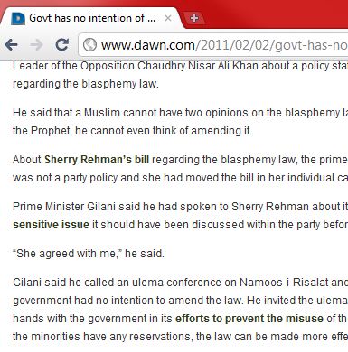
Unfortunately, with Cascading Style Sheets (CSS) it’s easy to make a total mess of accessibility guidelines. Dawn has had little or no guidance with their portal improvements but that’s no excuse to have black links.
Firstly, these links are hard to distinguish from bold text since they are identical to bold text. So now if the page has both, bold text and hyperlinks then the only way for a user to discover that is by hovering their mouse over it. The whole web is built on hyperlinks and it’s because of these lovely links that we can go off on tangents and then use the browser history feature (such as back and forward buttons) to keep track. But in this case the user has no idea what’s immediately clickable without inspecting each block of bold text. Just as frustrating is the experience of a user hovering over what seems like a link, only to discover that it’s just bold text. To make matters worse, Dawn’s visited links are the same color as unvisited links, so the user doesn’t really know if he has already read the hyperlinked article. That’s loss of information for no good reason.
Secondly, with the above change, hyperlinks have hijacked the bold style. Bold text competes with hyperlinks for attention but the reader will not know what the author truly intended to highlight. In fact, when the content writer finds his copy on the web, he’ll quickly realize that all the wrong stuff is appearing in bold and the emphasis of passages will be almost arbitrary.
Bolded, black links are bad enough but it should still be pointed out that underlines on hyperlinks are also preferred and are the default, by design. That’s because there are still some color blind people out there who would like to know what information is hyperlinked and can be consumed through a click. Even if you leave alone the color blind people, there are still plenty of devices that are handicapped in that they don’t have color screens. The users of these devices rely on the underlines as well.
In fact, for this and other reasons, the use of underlines is altogether deprecated for all other text and reserved exclusively for hyperlinks. This way hyperlinks get the prominence they deserve.
Note: Underlines are typically used in print because early typewriters could not do bold text. Purists will argue that artificial devices such as bold text or underlined text should not be used at all, instead, the writing itself should draw any emphasis. This is true for literary pieces, however for informational pieces, especially on the web, bold text improves the scannability of articles.

Comments
Post is no longer open for comments.