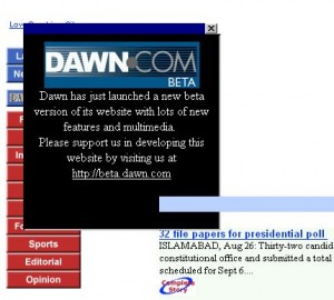
Dawn.com Beta Barely Worth the Effort
Dawn.com has launched their beta website available via dawn.net. Going with a phased roll-out through Beta is the only thing they seem to have gotten right and one can only hope they address the issues with the website or go for a complete overhaul. After spending 15 minutes on the website, I only hope they don’t take this live any time soon. Following are some things that immediately stuck out like a sore thumb.
- The unwelcoming invitation for dawn.com Beta is like the annoying popup ads you get on cheap warez sites. They could have at least tucked it in a corner instead of having it overlap navigation and content. And whatever happened to using cookies and giving users a “Do not ask me again” option. It’s an extra ~20 lines of code in the absence of which this annoying popup is displayed to the many thousands on every visit, every day.

- The website is optimized for 800×600. This is 2008. Only 8% of users use that resolution. 86% use 1024×768 or higher which provides 30% more screen real estate. All that space can be put to good use. This is a common problem with developers here who have very little interest in the discipline and read little or no literature pertaining to their field. If nothing else, I would suggest that the Dawn.net team take some lessons from news.bbc.co.uk or iht.com and follow their design principles, if they have any principles to begin with.
- The URLs are completely meaningless. They could have slapped together a few regular expressions with mod_rewrite or equivalent and respected the URL as a UI. Even if they fix this now, the older links will become obsolete and result in all existing links to those stories to break, a common problem known as link rot. Why downgrade from existing dawn.com/2008/02/28 type URLs?
- Placing advertisements in the main navigation is not only annoying it is a negative user experience. If they understood point (2) they would not be struggling to squeeze in these ads. Worse still, the advertisements cause navigation to drop below the page fold (the area which is not immediately visible and can only be reached by scrolling). That’s a usability blunder and shows that users are not even a priority. A side by side comparison of BBC’s and Dawn’s menus clearly highlights this intellectual divide:

- There are other design, usability and information architecture issues but I want to keep this post short and avoid a lecture on design and usability so I’ll say a little about their code. I was hoping to find half decent code because it’s such a high profile project but the code is atrocious and even comic relief doesn’t help (skyscraper spelt skycrapper in the code comments). Just consider the following code pattern that occurs close to a dozen times:
<script type="text/javascript"><!--
var x = 0;
var feaz = 0;
// --></script>
<script type="text/javascript"><!--
feaz ++;
x ++ ;
switch (x)
{
  case 1:
	document.write('
<td width="280" align="left" valign="top" class="fbg">...</td>
')
	break;

  case 2:
	document.write('
<td width="280" align="left" valign="top" class="fbg">...</td>
')
	break;

  case 3:
	document.write('
<td width="280" align="left" valign="top" class="fbg">...</td>
')
	break;

  case 4:
	document.write('
<td width="280" align="left" valign="top" class="fbg">...</td>
')
	break;

}
// --></script>
I never came across such code even when I was teaching Introduction to Programming at university. Why would anyone write a switch statement which says if value is 1, print X, if value is 2, print X, if value is 3 print X and if value is 4, print X. Why use a switch statement if all conditions print the same thing? It defies common logic. It’s code like this that causes pain down the line and simple feature requests can take days to implement and introduces bugs waiting to go off like land mines.
- There are no semi-colons to terminate some of those JavaScript statements (line 11) which is standard practise. HTML is being output using JavaScript when just plain HTML output would do (line 11). Unless there are very good reasons, the middle-tier is supposed to handle this sort of logic, not the front-end. The table cell has a CSS class which should be used for styling but the style elements are also defined using inline HTML (line 11). So if you wanted to increase the width of the columns, you must edit both the CSS and the HTML. What then is the purpose of using CSS? It defeats the whole purpose of CSS. The code uses meaningless and arbitrary variable names (lines 2 and 3).
- If you look at the CSS files (main.css and component.css) it’s plain to see that no one taught these developers what the Cascading in Cascading Style Sheets means. I also noticed some redundant CSS. Why write the same code twice? It takes up bandwidth, takes up more time rendering, more time to maintain and introduces bugs (developer updates one snippet but forgets to update the second identical snippet). The main.css is 34KB and the component CSS is 52KB. Then there’s some inline CSS. Wow! news.bbc.co.uk has a layout way more intricate and its ~65KB versus Dawn.net’s ~90KB of CSS. For example dawn’s h5 and h6 elements have the exact same style but instead of defining them using the same CSS block, Dawn.net repeats the 12 lines of code again. Dawn barely stylized its header/footer or menu bar. Even with 90KB of bad CSS, Dawn uses images for section headings instead of styled text. Imagine trying to manage or sift through 5000 lines of CSS code for the most minor aesthetic changes. I am considering using their CSS to exemplify what not to do in any future webdev presentations.
How can one even move to more serious guidelines for web development. I am so befuddled by this code I cringe just thinking about what kind of blunders they have committed in the back-end and middle-tier. This website does not even come up to par with most blogs out there, let alone be worthy of a news website. Even their current dawn.com website is a class-act in comparison and that has been around since at least 1997.
I am guessing this new website is going to be rife with problems going forward given its precarious state. Feature requests will probably take days to implement because of the poor architecture, and cryptic and unmanageable code. The only winners here would probably be the contractors billing Dawn for weeks/months of labour for even the most meagre feature request. And sadly, dawn.net might be in a bit of a sticky situation here with their contractors. If you want to get rich, build something that only you can maintain and takes you days to change so the client is locked in and ends up paying hefty amounts.
Update 8/31/2008: They don’t even have spell check in their CMS (Pakistan spelt Paklistan in title). It’s hard to image a publishing company using a publishing platform without spell check. Even my blog has spell check.
Update 10/31/2008: Sore eyes can seek out News Watch Pakistan as a considerably better alternative.
you were spot on in your criticism.
You forgot to update this post as dawn.net is going through quite a change everyday. I also think the need for a simple systematic code is remains much desired but its becoming a much better site than any other in Pakistan. Even the feeds you are taking in on your Pakistan news are mainly coming from there:)
Azeem I totally agree with you on everything and my blood starts boiling looking at anything Geo/Jang/The News. Their online presence reflect the aesthetics/skill level of their web team. But I would slightly disagree with you on Dawn. There is always room for improvement on the technical side no matter how sophisticated the design is, but their layout seems pretty clean to me. I find it easy to look for information and to be honest Dawn is the only website I am hooked to since past few months. I am not sure if it was horrible/extremely buggy before that. I think they are doing a good job with both their news site as well as the blog site. And I’ll be a happier reader if they address the problems you guys have been pointing out.
Qadir,
Dawn is one of the better sources of information and it’s my primary source. My entire family subscribes to it and has done so for years.
The point of contention is not Dawn, it’s Dawn’s new website. Whoever was incharge of building dawn.net did a downright horrible job. Most of what I have written still applies to the new website and I don’t see much improvement to be honest. I stand by what I have written.
Keep in mind this is the Beta version!!
My two emails to the DAWN webmaster and letters to the editor since discovering their glaring redesign, but no response:
Aug 20: The DAWN website has remained a pioneering news source for Pakistan. The outstanding feature of the website is the straightforward interface with no frills to detract from the contents. This in itself is a strong visual identity of DAWN, and reminds one of the print version. The new beta version jumps on the ‘modern’ design bandwagon, and end up resembling any other news website. The elegance of the current Internet Edition will be sorely missed.
Sept 18: As a concerned reader, regarding my previous email on your upcoming redesign, please do have a look at this website regarding the redesign of the World Street Journal website http://radaronline.com/exclusives/2008/09/all-the-internet-news-looks-the-same.php
Heyy! Last time i was on your blog was for ajax tutorial ages ago! That was via google, and now again via google, i find you for dawn beta. I think the issues that you point out are quite right but then I hope the dawn people would fix these things asap.
I ain’t even sure if they care much about how the code looks from the inside. They just seem to be wanting to put all their effort on the UI – which still has issues , some of which you pointed out.